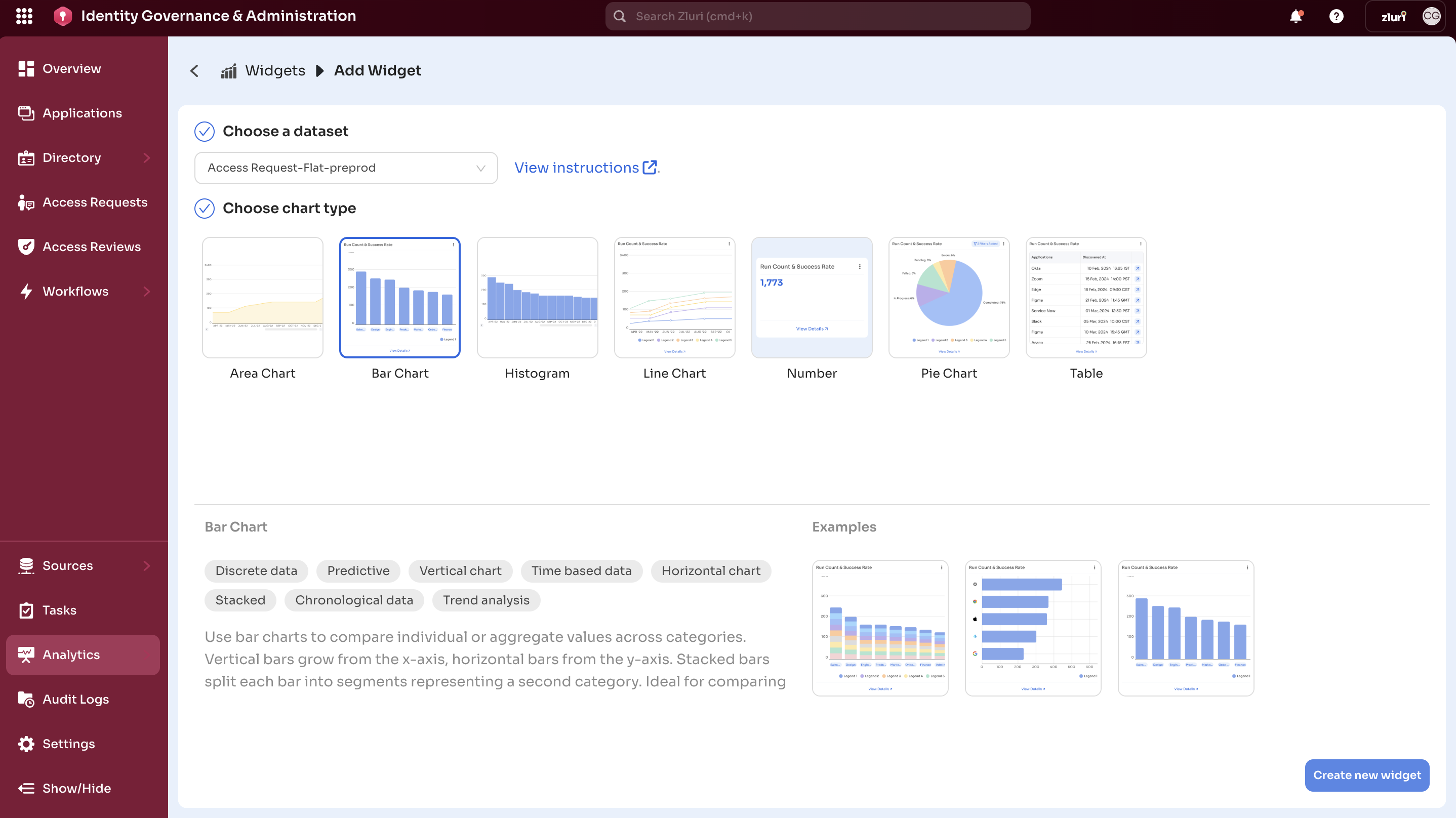
Chart Types in Zluri
When creating a widget in Zluri, users select a dataset and apply a chart type to define how the data will be visually represented. This guide outlines the available chart types, recommended use cases, and selection tips.
How Charts Work
Each widget is a combination of:
- Dataset – The underlying data (e.g., users, applications, spend)
- Chart Type – The visualization method (e.g., bar, KPI, table)
- Configuration – Field selection, filters, formatting, etc.
The fields available in the dataset influence which chart types are supported.
Supported Chart Types
1. Line Chart
Plots data points over time to visualize trends.
-
Use Cases:
- Application spend trends
- Login activity over weeks or months
- License growth tracking
-
Tags:
Trendline,Time Series,Line Plot,Platform Analytics
2. Bar Chart
(Vertical, Horizontal, Stacked)
Compares values across categories.
-
Use Cases:
- Spend by app
- Access requests by department
- App usage by location
-
Tags:
Stacked,Predictive,Discrete,Trend analysis
3. Table Chart
Displays raw, detailed data in rows and columns.
-
Use Cases:
- App-wise license and usage breakdown
- User access listings
- Contract metadata summaries
-
Tags:
Sequential,Aggregated Data,Variations,Multi-field
4. Big Number (KPI)
Highlights a single metric—total, average, or percentage.
-
Use Cases:
- Total SaaS spend
- Number of active users
- % license utilization
-
Tags:
KPI,Summarization,Aggregated Metric,Single Value
5. Pie Chart
Visualizes part-to-whole relationships using circular segments.
-
Use Cases:
- Spend distribution by vendor
- Users by department
- App usage by geography
-
Tags:
Category,Segment,Region,Label,Status
6. Histogram
Displays frequency distribution by grouping numeric values into bins.
-
Use Cases:
- Access duration analysis
- User distribution by activity
- Cost segmentation
-
Tags:
Data Quality,Numeric Range,Clustering,Patterns
7. Area Chart
Highlights cumulative trends with shaded areas under lines.
-
Use Cases:
- Cumulative license assignment
- Monthly spend growth
- Access growth by department
-
Tags:
Cumulative,Time-based,Performance,Geographical
Choosing the Right Chart
| Goal | Recommended Chart Type |
|---|---|
| Show trends over time | Line Chart, Area Chart |
| Compare categories | Bar Chart, Pie Chart |
| Highlight a key metric | Big Number |
| Display detailed records | Table |
| Visualize distribution | Histogram |
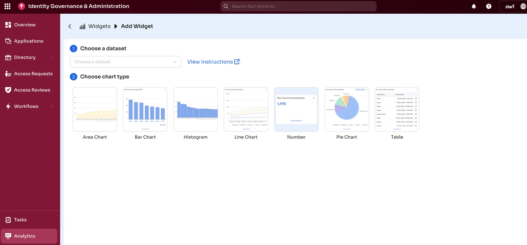
Chart Type Quick Reference
| Chart Type | Best For | Example Use Case |
|---|---|---|
| Line Chart | Time-based trends | App spend trend per month |
| Bar Chart | Category comparisons | Apps with highest user count |
| Stacked Bar | Multi-dimensional breakdowns | Access levels by department |
| Pie Chart | Part-to-whole comparisons | Spend by department |
| Big Number | Key metrics/KPIs | Total SaaS spend |
| Table | Detailed reporting | License count vs. usage |
| Area Chart | Cumulative analysis | Cumulative licenses issued |
| Histogram | Distribution and outliers | User count by login frequency[ |
Pro Tips
- Use Flat datasets for high-level KPIs and summaries.
- Use Expanded datasets for detailed, user-level views.
- Apply DISTINCT or groupings when using Pie, Bar, or Line charts on expanded datasets.
- When unsure, use a Table Chart to preview the dataset layout.
Updated 5 months ago