Widgets
Widgets in Zluri
Widgets are reusable, visual components that form the core of Zluri’s Analytics module. They are the building blocks of dashboards and allow users to correlate and visualize platform-wide data from SMP and IGA.
Each widget is based on:
- A dataset (underlying data source)
- A chart type (visual representation)
Widget Types in Zluri
Zluri supports two types of widgets within the Analytics module:
- Standard Widgets – Pre-built by Zluri for common use cases
- Custom Widgets – User-defined visualizations built using available datasets and chart types
Widgets serve as reusable components that power dashboards, helping visualize data across IGA and SMP modules.
Standard Widgets
Standard Widgets are pre-built by the Zluri team to support common use cases and reporting best practices.
| Attribute | Description |
|---|---|
| Created by | Zluri Team |
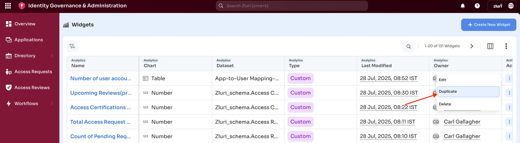
| Editable | Not editable, but can be duplicated |
| Visibility | Available to all users with Analytics access |
| Available In | Standard dashboards and custom dashboards |
| Purpose | Provide baseline KPIs and insights across SMP and IGA |
Custom Widgets
Custom Widgets are user-defined and fully customizable. They allow teams to tailor insights to specific business functions or use cases.
| Attribute | Description |
|---|---|
| Created by | Dashboard owners, analysts, or platform admins |
| Editable | Fully editable - includes chart type, filters, and formatting |
| Visibility | Based on dataset permissions |
| Available In | Any dashboard owned or shared with the user |
| Purpose | Enable function-specific, departmental, or personal analytics |
Custom Widget Capabilities
- Choose from 20+ datasets
- Select flat or expanded views
- Apply filters, groupings, and aggregations
- Choose from multiple chart types: bar, line, pie, table, KPI
- Reuse across multiple dashboards
How to Create a Custom Widget
Custom widgets can be created from scratch or by duplicating and editing a standard widget.
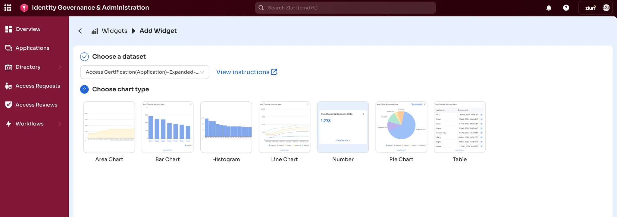
Step 1: Select Dataset
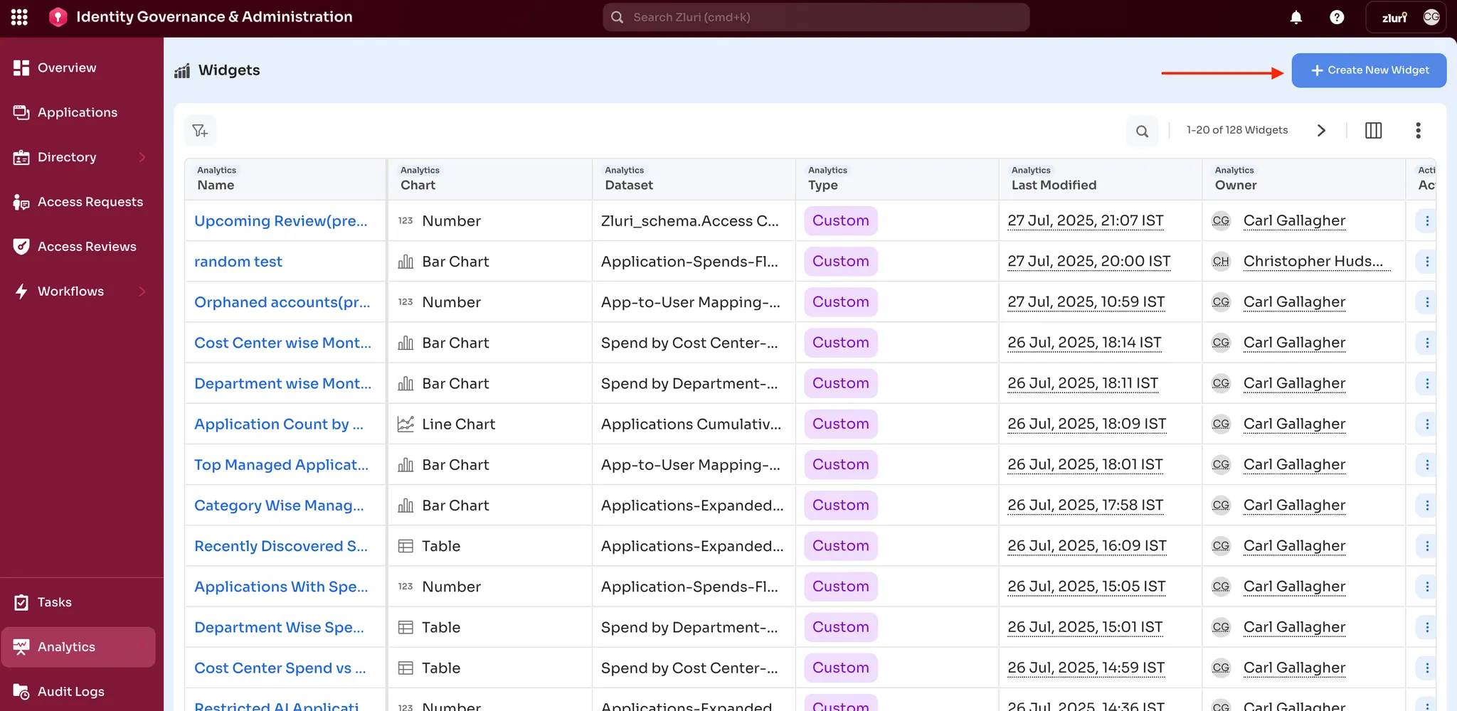
- Navigate to Analytics > Widget > Create New Widget
- Select a dataset (e.g., App-to-User Mapping) to define the source
Step 2: Choose Chart Type
- Pick a chart type appropriate to your dataset (e.g., Bar Chart for comparisons)
- Identify whether the dataset supports flat or expanded views for proper aggregation
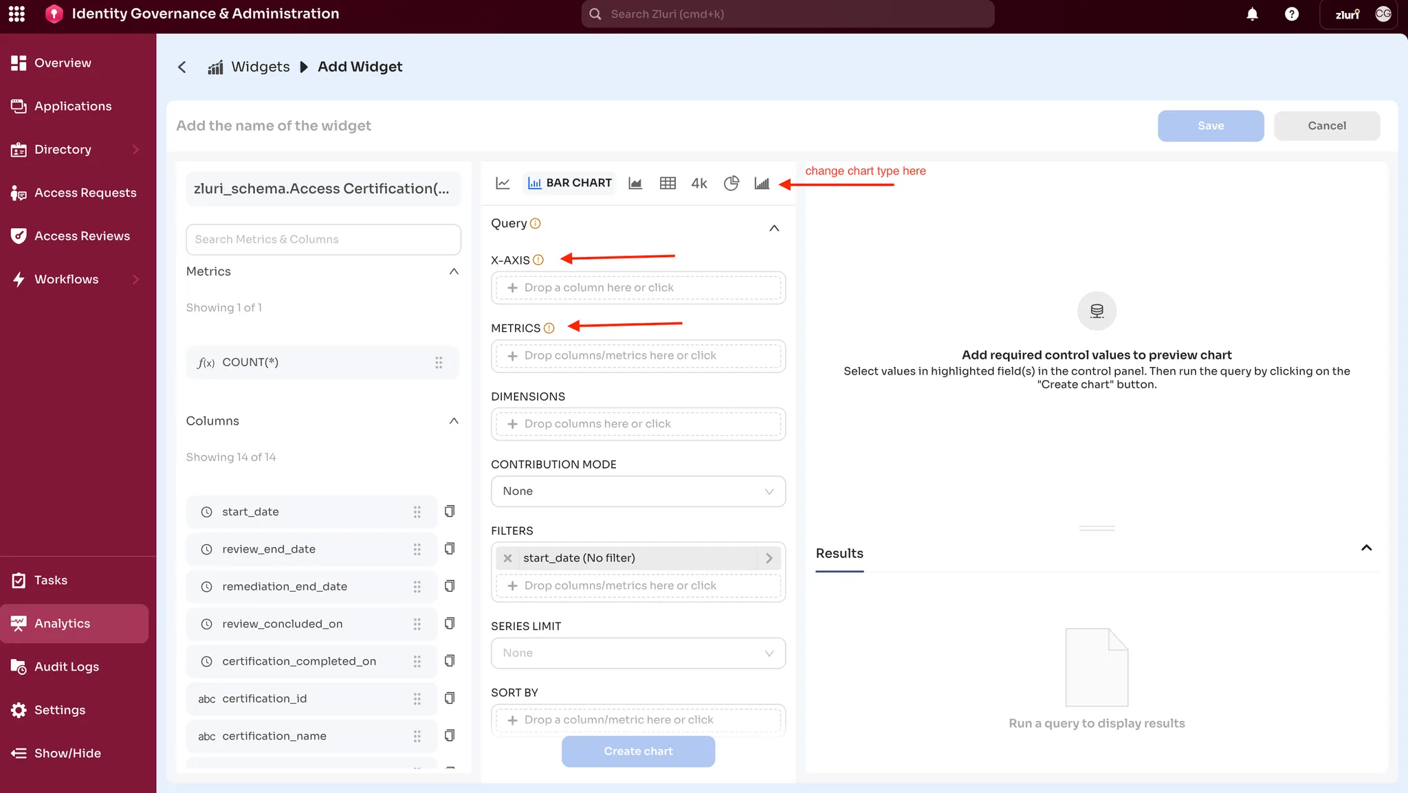
Step 3: Configure Widget
- Define the X-axis and Y-axis
- Add filters (e.g., time range, department, app type)
- Apply sorting and aggregation (e.g., SUM, COUNT, AVG)
- Customize chart formatting (titles, colors, labels)
- Save the widget for use in any dashboard
Updated 3 months ago