Zluri 2.0
Overview
What is Zluri 2.0
Zluri 2.0 is a complete revamp of the platform’s interface and user experience, designed to be faster, smarter, and more intuitive. With extensive improvements to UI patterns, information architecture, and data visualizations, Zluri 2.0 marks a significant leap forward from Zluri V1.0. This offers radically intuitive platform experience—rebuilt from the ground up to empower IT and security teams to act faster, work smarter, and operate with greater independence.
Purpose of the redesign
The redesign of Zluri was driven by a singular goal: to empower IT and security teams to move faster, think clearer, and act with greater autonomy. Over time, as the platform expanded in capabilities, the experience became dense and harder to navigate. Zluri 2.0 addresses this by rethinking not just how the platform looks—but how it works. We’ve redesigned the interface to reduce friction, reorganized navigation to mirror how teams actually work, and introduced consistent UI patterns to bring clarity and predictability across every page. Every pixel and interaction has been evaluated with the user in mind. This isn’t a cosmetic change. It’s a foundational shift to make Zluri simpler, faster, and smarter—so your teams can focus less on figuring out the tool, and more on getting the job done.
Key improvements and why they matter
Zluri 2.0 introduces several critical enhancements that go beyond aesthetics—they solve real usability problems, unlock productivity gains, and lay the groundwork for a more scalable, intelligent platform experience.
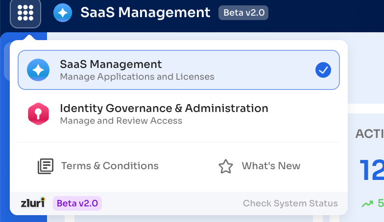
Reimagined Navigation
What’s new:
-
Split navigation for Identity Governance (IGA) and SaaS Management.
-
Modules like Access Request and Access Reviews moved from SaaS to IGA.
-
The workflow module is moved to IGA.
-
Left-aligned secondary navigation replacing horizontal tabs.
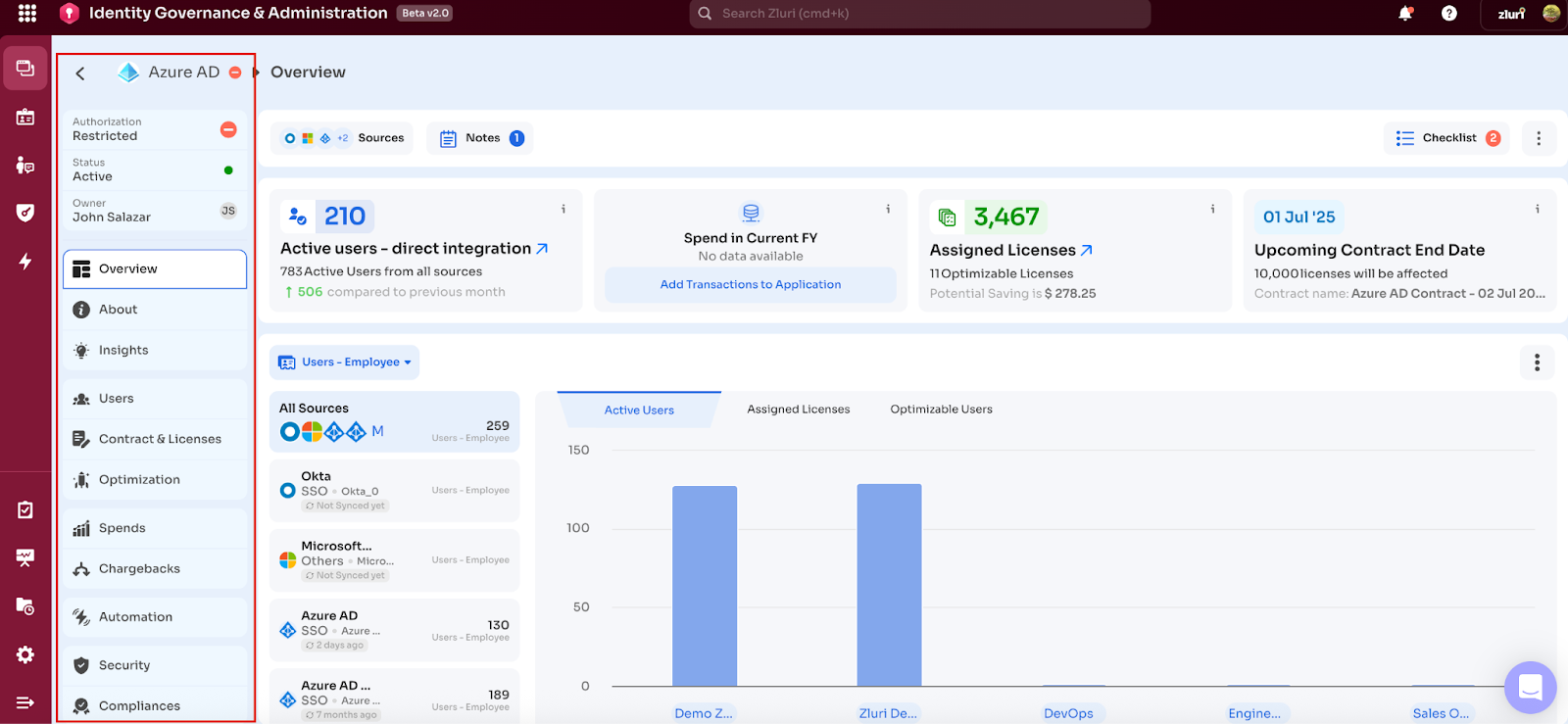
Why it matters:
This structure mirrors how teams work—making context switching seamless and navigation intuitive. Secondary navigation on the left side eliminates the tab clutter and ensures users can access deep-linked pages without losing orientation. It also solves horizontal overflow problems & allows unlimited sub-pages.
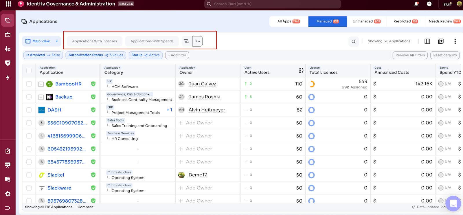
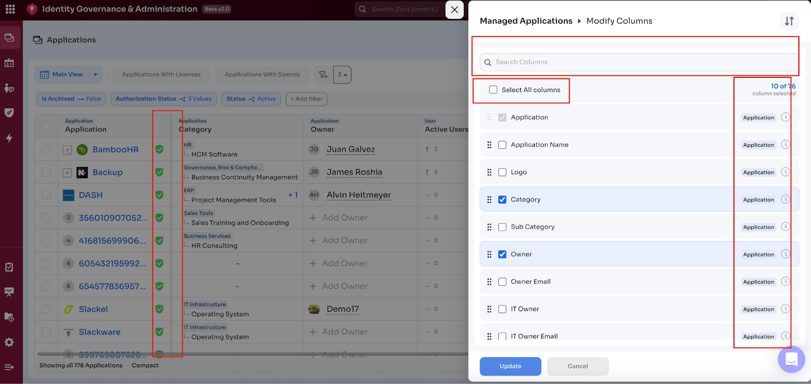
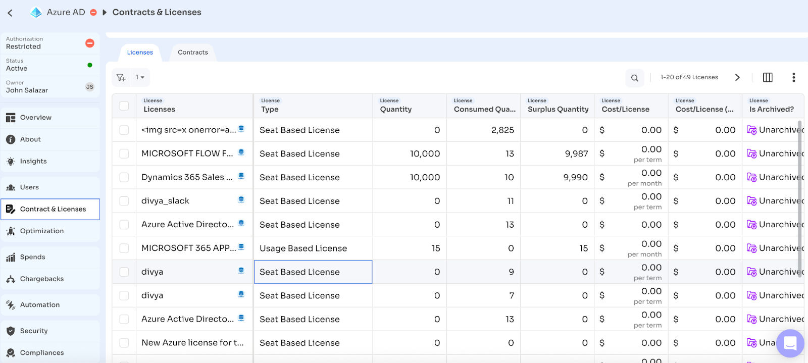
Smarter, More Powerful Tables
Whats new
-
Standardized columns, filters, and exports across all tables.
-
Extended default views & Quick filters.
-
Consistent grouping of column and enhanced capabilities with resize, freeze, show/hide & tool tips.
- Enhanced filtering and search that work together (The search work on top of filters rather than replacing the filters).
Why it matters:
Tables are where most of the analysis and decisions happen and are one of core UI components in Zluri. These changes reduce cognitive load, allow for faster slicing of data, and ensure consistency across modules—making everyday work more efficient.
Intuitive Filters
What’s New
-
Like columns, filters are also grouped based on data types, making it easier to locate and apply the right parameters.
-
Search within filters is supported
-
A persistent "Applied Filters" row always displays the active filters at the top of the table, with easy options to modify or remove them.
-
Direct Filter from table columns like you apply search in a spreadsheet.
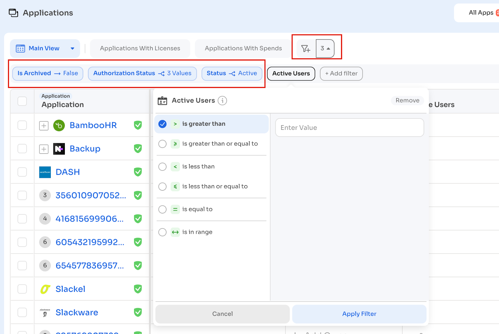
Why It Matters
The new filtering experience reduces friction and improves clarity—helping users find the right data faster and take action with confidence. It works consistently across modules, minimizing effort and errors.
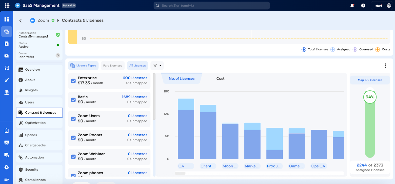
Unified Page Layouts with Visual Insights
What’s new:
Zluri 2.0 introduces a unified, consistent layout structure across all major modules—from Applications to Licenses to Spend and Optimization. Every page is now composed of three intuitive sections:
-
Summary Metrics – High-level KPIs to give immediate context (e.g., Total Apps, Active Users, Spend to Date)
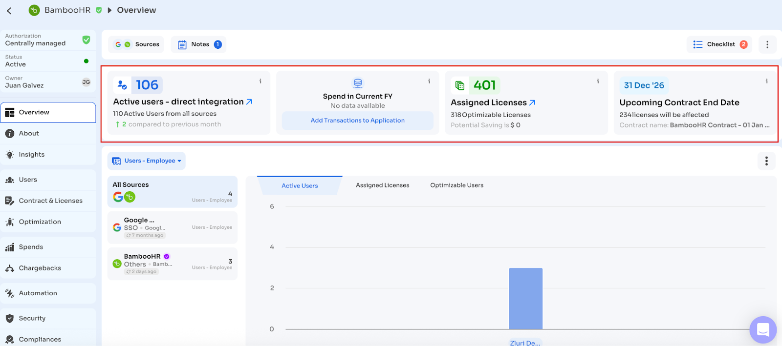
-
Interactive Graphs – Visual insights with filtering capabilities, trend lines, and breakdowns
-
Detailed Tables – Raw, actionable data with advanced filtering, export, and inline actions
This layout standard is applied uniformly across modules like Applications, Contracts, Chargeback, Access, and Optimization.
Additional enhancements include:
- Downloadable graphs (CSV)
- Source-based filtering (e.g., by Okta, Google, Zoom)
- Departmental and user-level breakdowns
- Granular views into optimizable users, license allocation, and spending patterns
Why It Matters
This redesign was shaped by storyboarding real user behavior across roles like IT Ops, Security, Procurement, and Finance. What we discovered was a common mental model:
“When I land on a page, I want to quickly understand what’s happening, spot anomalies or trends, and then dive deeper only if needed.”
The new layout directly supports this journey:
- Scan → Understand: With summary metrics and clean visuals at the top, users immediately grasp the big picture—without needing to scroll or dig.
- Explore → Discover: Interactive graphs help identify patterns, outliers, or opportunities (e.g., spike in app usage, rising cost centers) before diving into rows of data.
- Act → Validate: When ready, users can drop into the detailed table, apply filters, and take direct actions—all while retaining visibility into the larger context above.
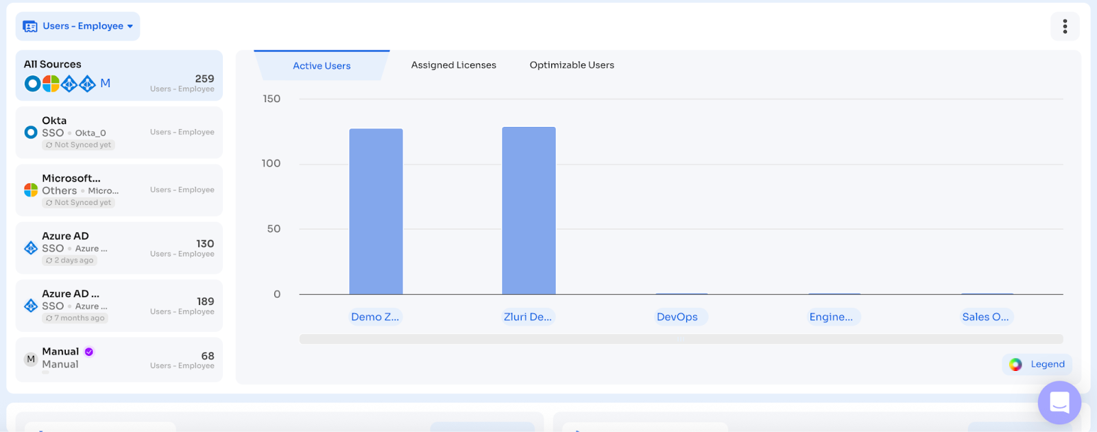
Enhanced Visualizations
Zluri 2.0 transforms complex datasets into actionable insights through clean, interactive visuals. These enhancements are grounded in user feedback and guided by a storyboarding-led design process to support how users scan, compare, and act.
Key visualization upgrades include:
-
Consistent Graph-First Layouts across modules like Spend, Chargeback, Optimization, and Contracts
-
Department-wise and Role-wise Breakdown Graphs for active users, assigned licenses, and optimization potential
-
Dynamic Filtering by Source (e.g., Okta, GSuite, Zoom) directly within visual panels
-
Graph Download as CSV, enabling teams to easily share and embed insights into reports
-
Stacked Bar, Trend Line & Donut Chart Variants used based on data type for better interpretability
Why It Matters
Visualization in Zluri 2.0 isn’t decorative—it’s strategic. Zluri 2.0 transforms raw data into meaningful stories. By prioritizing visual context and interpretability, we enable faster decisions, better alignment across stakeholders, and increased confidence in the data driving your actions. The enhancements are designed to mirror how decision-makers think and how analysts work.
Live & Consistent Data Across the Platform
One of the foundational strengths of Zluri 2.0 is its shift to consistent data rendering across the platform through an upgraded backend architecture. With a unified data layer powering every module, metrics, summaries, and tables now reflect the same real-time information—ensuring accuracy and alignment. This consistency builds trust, reduces ambiguity, and enables faster, more confident decision-making across teams.
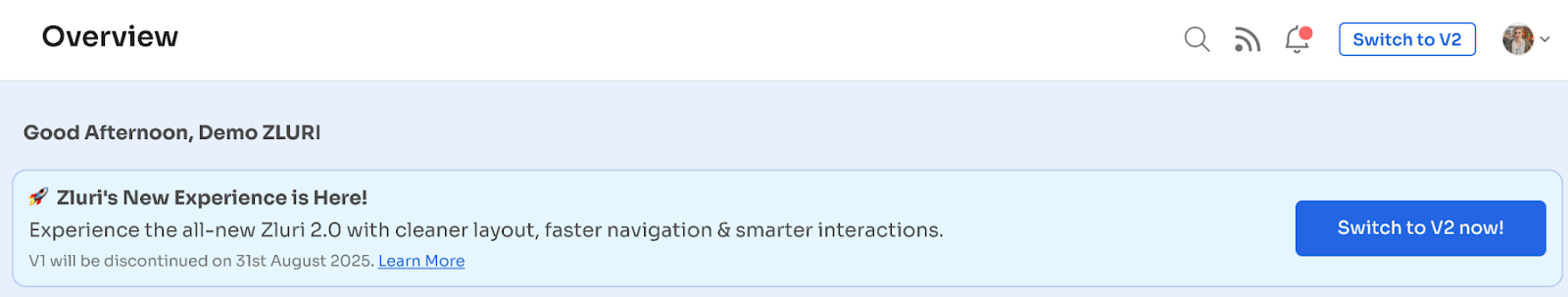
How to switch, how to switch back
You can switch to Zluri 2.0 by clicking on the banner on the overview screen or the top right button besides your profile icon.
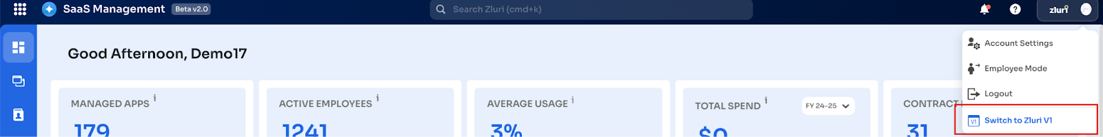
Once you switch to Zluri 2.0 you continue to stay in Zluri 2.0 unless you explicitly switch back to V1 by clicking on the ‘Switch to V1’ button on your profile icon.
Important Points to Note
- Currently the Application Module & Users page has been completely transformed into Zluri 2.0 experience while other modules have been migrated to Zluri 2.0 navigation making all modules available in Zluri 2.0 navigation experience.
- Switching to Zluri 2.0 does not impact the data & workflows. All functionalities of Zluri V1.0 will work seamlessly in Zluri 2.0.
- There are certain UI touch points that are not currently available in Zluri 2.0 which we are continuously working on which will be available in Zluri 2.0 before the end of august.
- You can switch back to V1 anytime you would like to, Again this will not impact any data or workflows.
Updated 11 months ago